初めてのWPF 10日目
2019/01/26
PrismのCustomPopupを使う
2020/10/13追記
InteractionRequestを使ったこのダイアログ表示は時代遅れだそうです。dialog serviceという便利なものができています。
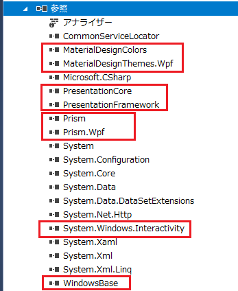
TreasurerHelper.Infrastructureに参照追加
もともと通常のライブラリ用テンプレートで作成したので、足りないものが一杯。コントロール専用プロジェクトを作ることも考えましたが、TreasurerHelper.InfrastructureにControlsフォルダを作成しました。
別プロジェクトのUserControlを参照する
最初コントロール専用のプロジェクトを作成した時に、非常に親切なコメントが添えられていたのでそれほどはまらずにすみました(^^;)。NameSpaceはアセンブリ名を付ける必要があるとのこと。
<UserControl ・・・
xmlns:cc="clr-namespace:TreasurerHelper.Infrastructure.Controls;assembly=TreasurerHelper.Infrastructure"
・・・
無事表示されました。
IInteractionRequestAwareを実装
とりあえずサンプルをそのままコピー。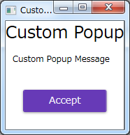
後はMaterialDesignのDialogを適用するだけ!
のはずがDialogが単なるテーマではなく結構高機能で大掛かり。Prismを取るかMaterialDesignを取るかで悩む。
やはり機能はPrismで通したい、ということでMaterialDesignのDialogは諦める。
似たようなデザインにするにはCustomPopupをMaterialDesignのCardに載せ、ウインドウの枠を消す。
Cardに載せるのは簡単
<Grid Background="Transparent">
     <md:Card Margin="10">
         <StackPanel Margin="16">
            <TextBlock Text="{Binding Title}" FontSize="24" HorizontalAlignment="Center"/>
            <TextBlock Text="{Binding Content}" Margin="10" />
            <Button Margin="25" Click="Button_Click">Accept</Button>
         </StackPanel>
    </md:Card>
</Grid>
Windowの枠を消す設定は調べたら直ぐ分かった
<Setter Property="WindowStyle" Value="None" />
<Setter Property="AllowsTransparency" Value="True"/>
だが対象のWindowがどこにあるか分からない…
CustomPopupをUserControlからWindowに変えたらルートじゃないのにWindow使うなと怒られる。ここからPopupWindowActionとWindowStyleでこちらにたどりつく。
<i:Interaction.Triggers>
    <prism:InteractionRequestTrigger SourceObject="{Binding FileOpenRequest}">
        <prism:PopupWindowAction IsModal="True" CenterOverAssociatedObject="True">
<prism:PopupWindowAction.WindowStyle>
    <Style TargetType="Window">
        <Setter Property="Background" Value="Transparent" />
        <Setter Property="WindowStyle" Value="None" />
        <Setter Property="ResizeMode" Value="NoResize" />
        <Setter Property="BorderThickness" Value="1" />
        <Setter Property="ShowInTaskbar" Value="False"/>
        <Setter Property="AllowsTransparency" Value="True"/>
    </Style>
</prism:PopupWindowAction.WindowStyle>
<prism:PopupWindowAction.WindowContent>
                <cc:CustomPopupView />
            </prism:PopupWindowAction.WindowContent>
        </prism:PopupWindowAction>
    </prism:InteractionRequestTrigger>
</i:Interaction.Triggers>
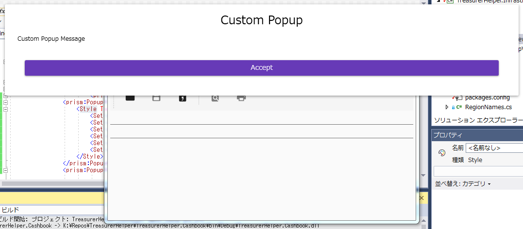
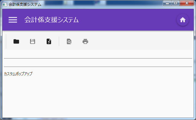
周りはそれっぽくなりましたが、思っていたのとはちょっと違う。
コントロールは使いまわししたいからコンテンツによって自動でサイズ変わって欲しい、と思ったらちょうどそれらしいタグが。
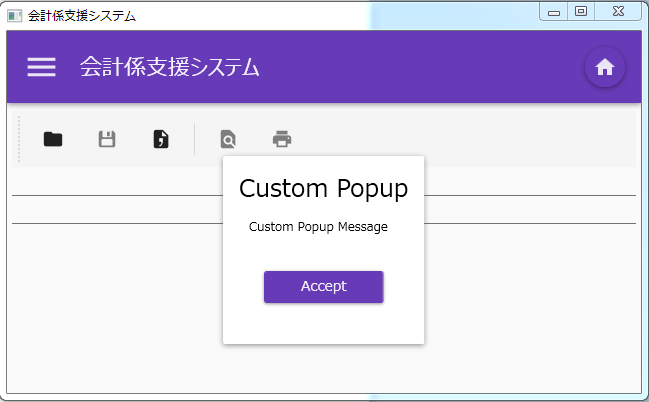
<Setter Property="SizeToContent" Value="WidthAndHeight" />追加したら思い描いていたようなイメージに!
でも毎回大量のタグをコピペするのは嫌
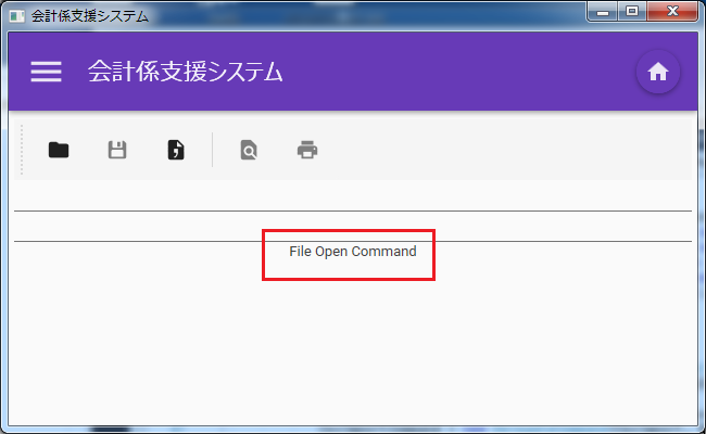
結局最初のリンクにもどりPopupWindowActionのGetWindowを上書きすることに。PopupChildWindowActionという名前から丸ごといただき、return wrapperWindow;
の前にWindowStyleの設定を追加。
wrapperWindow.WindowStyle = System.Windows.WindowStyle.None;
wrapperWindow.AllowsTransparency = true;
wrapperWindow.Background = Brushes.Transparent;
wrapperWindow.ShowInTaskbar = false;
wrapperWindow.ResizeMode = ResizeMode.NoResize;
wrapperWindow.SizeToContent = SizeToContent.WidthAndHeight;
// ↑の部分を追加
return wrapperWindow;
実行後のイメージはまったく同じですが、呼び出し部分が随分すっきりしました。
<i:Interaction.Triggers>
    <prism:InteractionRequestTrigger SourceObject="{Binding FileOpenRequest}">
        <cc:PopupChildWindowAction IsModal="True" CenterOverAssociatedObject="True">
            <prism:PopupWindowAction.WindowContent>
                <cc:CustomPopupView />
            </prism:PopupWindowAction.WindowContent>
        </cc:PopupChildWindowAction>
    </prism:InteractionRequestTrigger>
</i:Interaction.Triggers>