Region Navigation
2017/07/01
コードを読んでPrism6に書き換えるのは今の私の知識ではどう考えても無理。
デザインもxamlの知識が無いので躓いた箇所は後回し。
Prism6公式のサンプルを参照しながら元ネタに近いものを仕上げる方針に変えました。
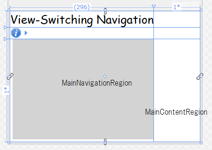
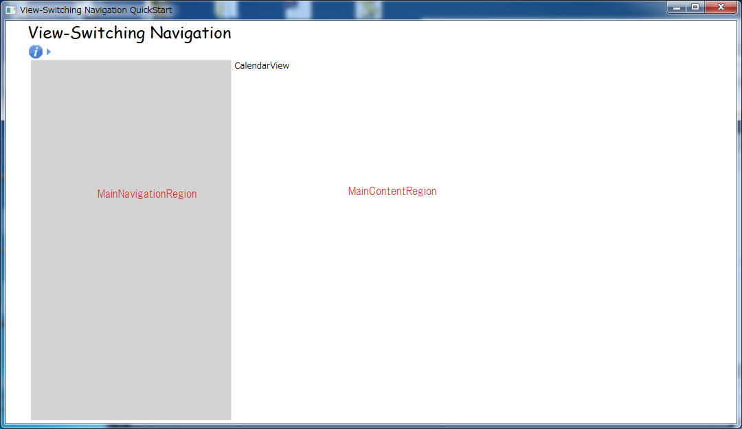
左側メインメニューにモジュールを切り替えるボタンを追加するのに、Region Navigationを使ってみました。
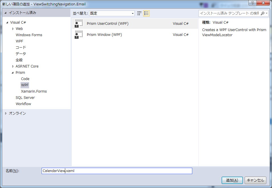
メニュー用View追加
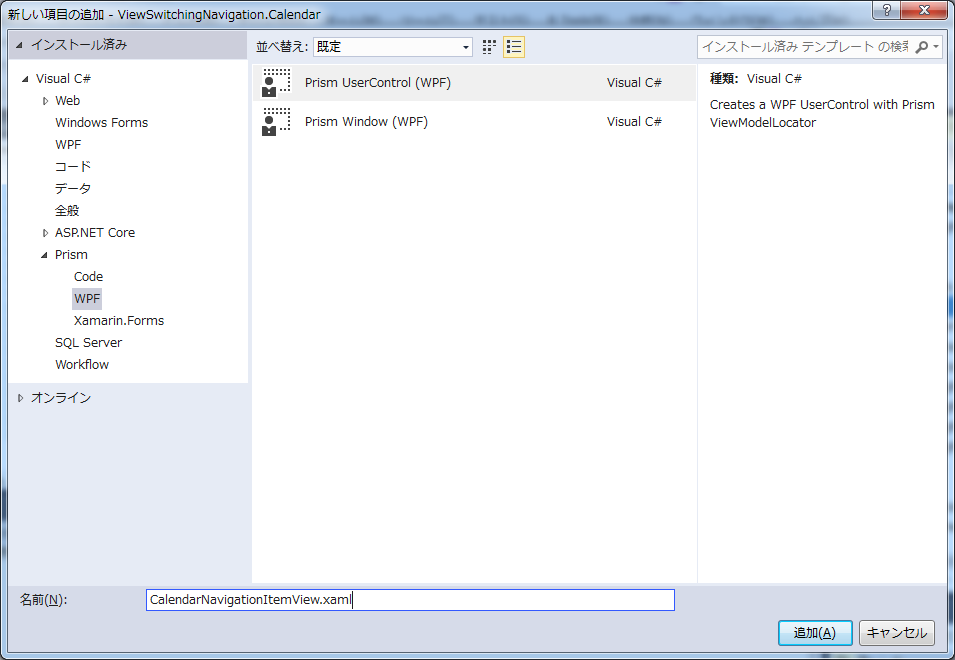
左側のRegion(MainNavigationRegion)に表示するメニューボタン用Viewを追加します。テンプレート:Prism UserControl
ファイル名:CalendarNavigationItemView.xaml
Viewのテスト用のTextBlockを追加。
CalendarModule.csの修正
public void Initialize()
{
    //_regionManager.RegisterViewWithRegion("MainContentRegion", typeof(Views.CalendarView));
    _regionManager.RegisterViewWithRegion(RegionNames.MainNavigationRegion, typeof(CalendarNavigationItemView));
}
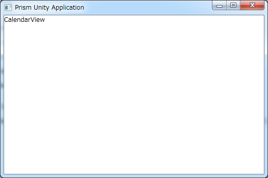
この時点では未だView-Switching Navigationのソースに近い形でいくつもりだったので、CalendarViewをコメントアウトし、CalendarNavigationItemViewを追加。実行してMainNavigationRegionに表示されていることを確認。

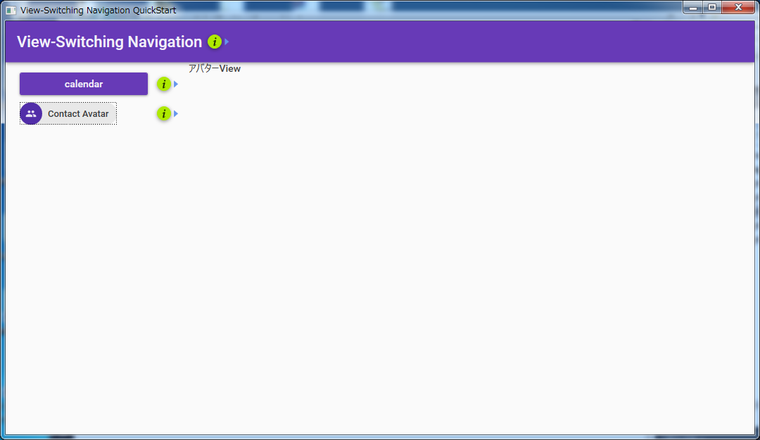
ナビゲーション用ボタン作成
サンプルからCalendarNavigationItemView.xamlのソースをそのままコピー。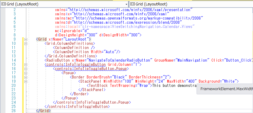
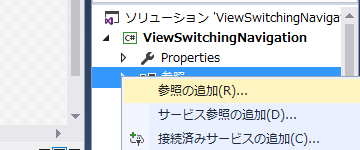
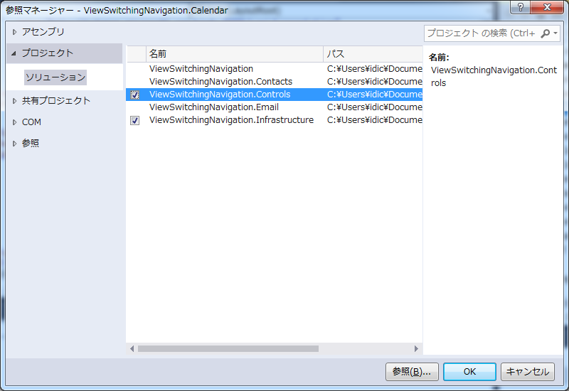
MainWindow.xamlの時と同じくエラーが出るので、ネームスペースとプロジェクトの参照を追加。
エラーの出るButton_Clickと不要なStyle属性削除して実行して確認。
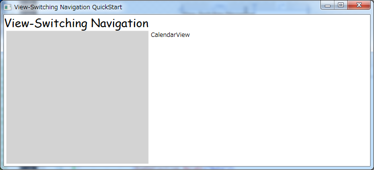
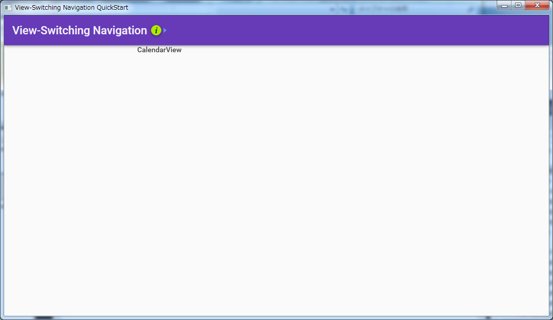
Material Designを適用し忘れたら下記のような感じ。
ボタンを揃えるにはモジュール追加する毎にまったく同じことを繰り返すか、ユーザーコントロールを作るか、モジュール用のテンプレートを充実させていくかする必要がありそう。
ナビゲーション機能の追加
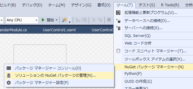
エラーを潰しながら組み込み始めたのですが、System.ComponentModel.Compositionが見つからずNugetで追加する必要があることが分かり方向転換。(テンプレートに含まれていないということは今の主流から外れそうなので)
Prism6のサンプルプロジェクトの中で一番近そうな17-BasicRegionNavigationを真似することにしました。
<UserControl x:Class="ViewSwitchingNavigation.Calendar.Views.CalendarNavigationItemView"
xmlns="http://schemas.microsoft.com/winfx/2006/xaml/presentation"
xmlns:x="http://schemas.microsoft.com/winfx/2006/xaml"
xmlns:prism="http://prismlibrary.com/"
prism:ViewModelLocator.AutoWireViewModel="True"
xmlns:controls="clr-namespace:ViewSwitchingNavigation.Controls;assembly=ViewSwitchingNavigation.Controls"
>
<Grid x:Name="LayoutRoot">
<Grid.ColumnDefinitions>
<ColumnDefinition />
<ColumnDefinition Width="Auto"/>
</Grid.ColumnDefinitions>
<Button Command="{Binding NavigateCommand}" CommandParameter="CalendarView" Margin="5">calendar</Button>
<!--<RadioButton x:Name="NavigateToCalendarRadioButton" GroupName="MainNavigation" IsChecked="{Binding NavigateCommand}" CommandParameter="CalendarView" AutomationProperties.AutomationId="CalendarRadioButton">Calendar</RadioButton>-->
<controls:InfoTipToggleButton Grid.Column="1">
<controls:InfoTipToggleButton.Popup>
<Popup>
<Border BorderBrush="Black" BorderThickness="2">
<StackPanel MinWidth="100" MinHeight="24" MaxWidth="400" Background="White">
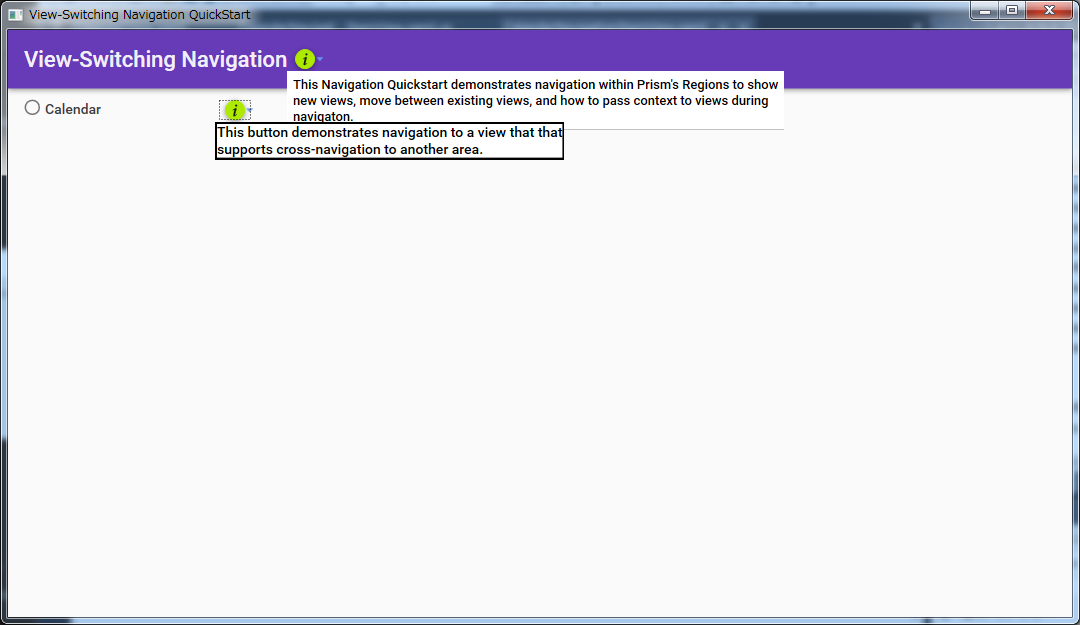
<TextBlock TextWrapping="Wrap">This button demonstrates navigation to a view that that supports cross-navigation to another area.</TextBlock>
</StackPanel>
</Border>
</Popup>
</controls:InfoTipToggleButton.Popup>
</controls:InfoTipToggleButton>
</Grid>
</UserControl>
RadioButtonに Command="Binding NavigateCommand" を追加する方法が分からなかったので、Prism6のサンプルにあわせボタンに変更。現在アクティブなボタンの色を変えるのは一通り動いた後余裕があれば。ボタンのxamlをモジュール側で記述するように変えたので、NavigateCommandをどこに記述するか悩み最初はViewSwitchingNavigation.CalendarにViewModelを追加して動作確認できましたが、同じことを他のモジュールでも行うのが面倒なのと、上記のxamlがNavigateCommand追加前でもエラーにならなかったので親プロジェクトの既存のViewModelに移動したところ、問題なく動きました。
カタログにモジュール追加する順序を変えてみた
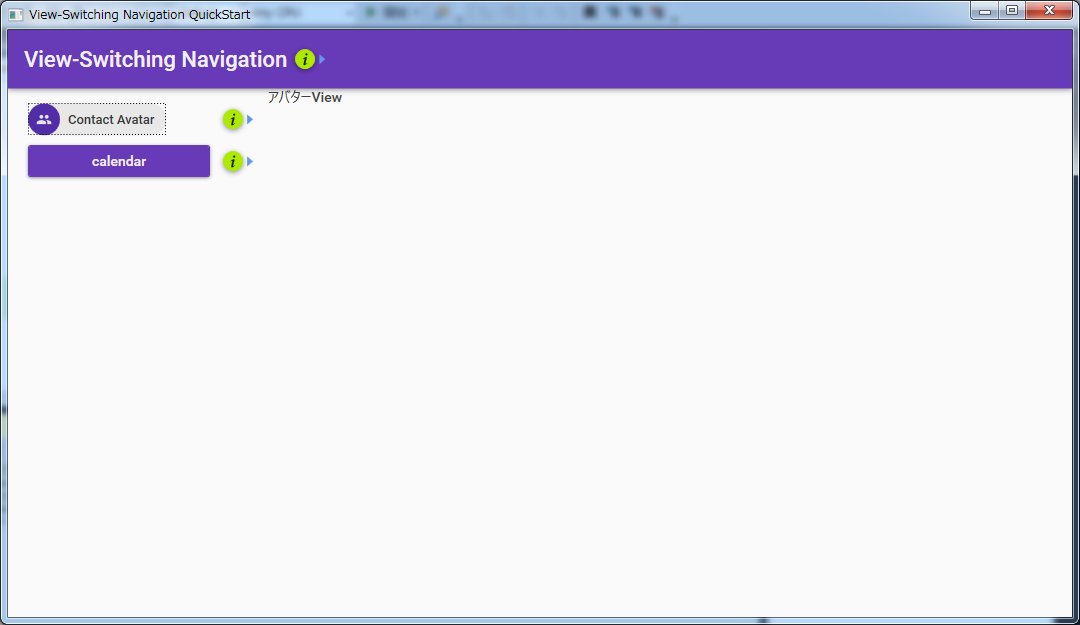
保証されているかどうか確認はしていませんが、上下を変えたら変わり、戻したら戻りました。